Quickstart
Motivation & Benefits
The Layout API was created as a performant alternative to UIKit’s Auto Layout, which becomes exponentially expensive for complicated view hierarchies. Texture’s Layout API has many benefits over using UIKit’s Auto Layout:
- Fast: As fast as manual layout code and significantly faster than Auto Layout
- Asynchronous & Concurrent: Layouts can be computed on background threads so user interactions are not interrupted.
- Declarative: Layouts are declared with immutable data structures. This makes layout code easier to develop, document, code review, test, debug, profile, and maintain.
- Cacheable: Layout results are immutable data structures so they can be precomputed in the background and cached to increase user perceived performance.
- Extensible: Easy to share code between classes.
Inspired by CSS Flexbox
Those who are familiar with Flexbox will notice many similarities in the two systems. However, Texture’s Layout API does not re-implement all of CSS.
Basic Concepts
Texture’s layout system is centered around two basic concepts:
- Layout Specs
- Layout Elements
Layout Specs
A layout spec, short for “layout specification”, has no physical presence. Instead, layout specs act as containers for other layout elements by understanding how these children layout elements relate to each other.
Texture provides several subclasses of ASLayoutSpec, from a simple layout specification that insets a single child, to a more complex layout specification that arranges multiple children in varying stack configurations.
Layout Elements
Layout specs contain and arrange layout elements.
All ASDisplayNodes and ASLayoutSpecs conform to the <ASLayoutElement> protocol. This means that you can compose layout specs from both nodes and other layout specs. Cool!
The ASLayoutElement protocol has several properties that can be used to create very complex layouts. In addition, layout specs have their own set of properties that can be used to adjust the arrangment of the layout elements.
Combine Layout Specs & Layout Elements to Make Complex UI
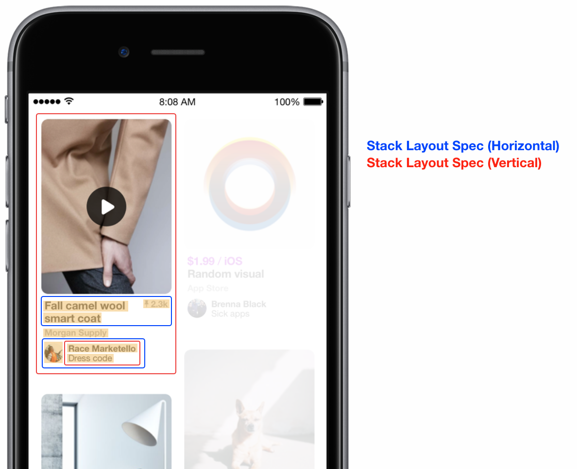
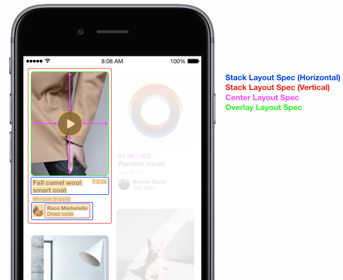
Here you can see how ASTextNodes (highlighted in yellow), an ASVideoNode (top image) and an ASStackLayoutSpec (“stack layout spec”) can be combined to create a complex layout.

The play button on top of the ASVideoNode (top image) is placed using an ASCenterLayoutSpec (“center layout spec”) and an ASOverlayLayoutSpec (“overlay layout spec”).

Some nodes need Sizes Set
Some elements have an “intrinsic size” based on their immediately available content. For example, ASTextNode can calculate its size based on its attributed string. Nodes that have an intrinsic size include
ASImageNodeASTextNodeASButtonNode
All other nodes either do not have an intrinsic size or lack an intrinsic size until their external resource is loaded. For example, an ASNetworkImageNode does not know its size until the image has been downloaded from the URL. These sorts of elements include
ASVideoNodeASVideoPlayerNodeASNetworkImageNodeASEditableTextNode
These nodes that lack an initial intrinsic size must have an initial size set for them using an ASRatioLayoutSpec, an ASAbsoluteLayoutSpec or the size properties on the style object.
Layout Debugging
Calling -asciiArtString on any ASDisplayNode or ASLayoutSpec returns an ascii-art representation of the object and its children. Optionally, if you set the .debugName on any node or layout spec, that will also be included in the ascii art. An example is seen below.
-----------------------ASStackLayoutSpec----------------------
|  -----ASStackLayoutSpec-----  -----ASStackLayoutSpec-----  |
|  |       ASImageNode       |  |       ASImageNode       |  |
|  |       ASImageNode       |  |       ASImageNode       |  |
|  ---------------------------  ---------------------------  |
--------------------------------------------------------------
You can also print out the style object on any ASLayoutElement (node or layout spec). This is especially useful when debugging the sizing properties.
(lldb) po _photoImageNode.style
Layout Size = min {414pt, 414pt} <= preferred {20%, 50%} <= max {414pt, 414pt}
